

Why We Love Mid-Century Modern Graphic Design.

In the world of design, few styles evoke the timeless allure and sophistication quite like Mid-Century Modern. We're obsessed with this iconic aesthetic. Here are a few reasons why we can't get enough of it and how we’re still inspired by the greats like Saul Bass, Paul Rand and Lucienne Day.
{Lucienne and Robin Day - geometric shapes. Sourced from Victoria and Albert Museum, UK}
This iconic aesthetic revolutionised the visual landscape, leaving an indelible mark on design principles that resonate to this day. From the use of geometric shapes to the influence of Bauhaus and Swiss typefaces. Mid-Century Modern graphic design embraces the mantra of "less is more," with a focus on uncluttered compositions and crisp, straight lines. From logo designs to poster layouts, the use of clean lines creates a sense of order and sophistication. Simplicity allows for clear communication and enhances the visual impact of graphic elements, drawing the viewer's attention to a focal point.
Geometry reigns supreme in Mid-Century Modern graphic design, as Paul Rand said “You can’t criticise geometry, it’s never wrong”. The power of geometric forms like rectangles, circles, triangles and squares creates dynamic visual experiences. These shapes are employed to convey balance, rhythm and harmony in graphic compositions. The strategic use of geometric shapes adds a sense of modernity and elegance to graphic design, capturing the essence of Mid-Century Modern aesthetics.
Bold and distinct colour palettes that infuse vibrancy and energy into visual compositions are essential to Mid-Century design. Colour palettes vary greatly from bright, saturated hues to earthy and warm creating striking contrasts. These bold colour choices contribute to the overall impact of Mid-Century Modern graphic design, leaving a lasting impression on viewers.
Typography plays a pivotal role in conveying clarity, functionality and aesthetic appeal. Drawing inspiration from the precision of Swiss typography and the experimental spirit of Bauhaus, Mid-Century typographers forged a path that continues to influence contemporary design practices. Bauhaus typographers like Herbert Bayer and Jan Tschichold embraced experimental techniques that embraced function and clarity. Swiss typography emerged as a defining feature of Mid-Century Modern design. Influential typographers such as Max Miedinger (creator of Helvetica) and Adrian Frutiger (designer of Univers) revolutionised the field with their emphasis on clarity, simplicity and legibility.
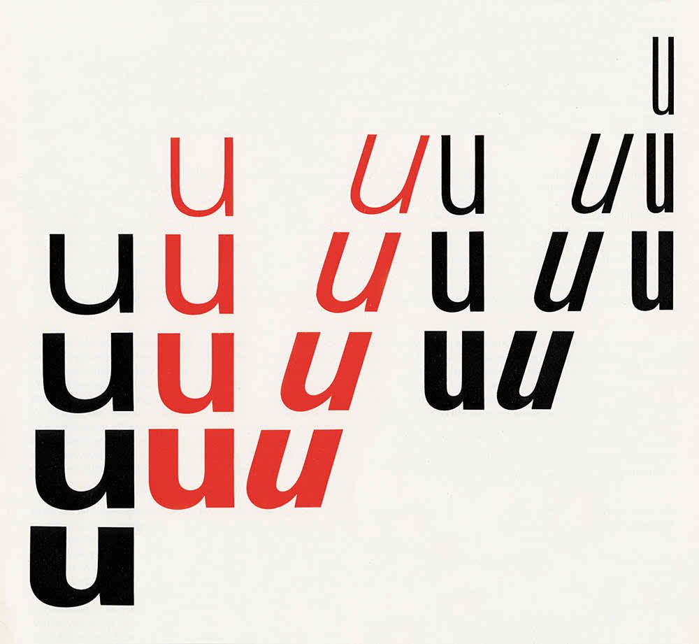
{Univers Typeface by Adrian Frutiger - Sourced from Famous Graphic Designers}
Mid-Century Modern graphic design continues to captivate and inspire, its emphasis on clean lines, geometric shapes, bold colours and minimalist typography embodying a timeless elegance. We can always draw inspiration from the principles of Mid-Century Modernism, infusing our graphic design projects with clarity, sophistication and visual impact. We love the enduring allure of Mid-Century Modern graphic design and the transformative impact on the world of design